American Locomotive
Well-known member
It looks really great! Much nicer, customized and well thought out compared to other XenForo migrations I've seen *cough*. You can tell a lot of care and thought went into the style on this site!
My only two concerns are:
1) The default post font has some readability issues. It probably looks in really large sizes, but it doesn't reproduce well on the sizes used for posts. The kerning space is also way too close, make it tough to differentiate between characters.
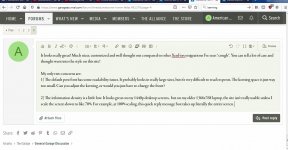
2) The information density is a little low. It looks great on my 1440p desktop screens, but on my older 1366x768 laptop, the site isn't really usable unless I scale the screen down to like 70%. For example, at 100% scaling, this quick reply message box takes up literally the entire screen. There are still a lot of laptops out there running this screen resolution. See attached screenshot:
My only two concerns are:
1) The default post font has some readability issues. It probably looks in really large sizes, but it doesn't reproduce well on the sizes used for posts. The kerning space is also way too close, make it tough to differentiate between characters.
2) The information density is a little low. It looks great on my 1440p desktop screens, but on my older 1366x768 laptop, the site isn't really usable unless I scale the screen down to like 70%. For example, at 100% scaling, this quick reply message box takes up literally the entire screen. There are still a lot of laptops out there running this screen resolution. See attached screenshot: