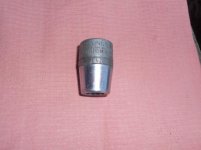
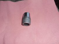
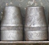
I am not sure what exactly I like about this type of font, but the more I see it the more I like it. At first its’ plain script makes it look functional for responsible adults, then you notice these letters are slanted and shrink then get larger finally
ending up as large as the first letters... which says, “ I’m formal, but I’m here to party”. All kidding aside, it looks really well made, it looks very similar to the Proto socket and used similar part numbers with the Challenger socket
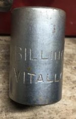
ending up as large as the first letters... which says, “ I’m formal, but I’m here to party”. All kidding aside, it looks really well made, it looks very similar to the Proto socket and used similar part numbers with the Challenger socket