To avoid these ads, REGISTER NOW!

KC Tool - New Website Preview

KCT_Jordan

Well-known member
Joined
Jul 24, 2014
Messages
76
Location
Olathe, KS, USA
We are pleased to introduce our new beta site! We have been working on it for months, and it is finally ready.

beta.kctoolco.com

We would like your feedback on the new design and welcome any suggestions on how we can improve the shopping experience. Garage Journal members helped us tremendously a few years ago when we began designing our first website. We wanted to again share our new website with the best tool enthusiast community on the web.

Please enjoy $5 off any order placed on the beta website as we continue to fine tune the site. The discount is applied in the cart at checkout.

Our old site will continue to be up and running while the new site is still in beta. You will be able to access your old order history even after the change to the new website is completed.

One of the changes we are most excited about is that you are now able to browse around on your phone or tablet as easily as you can on a desktop.

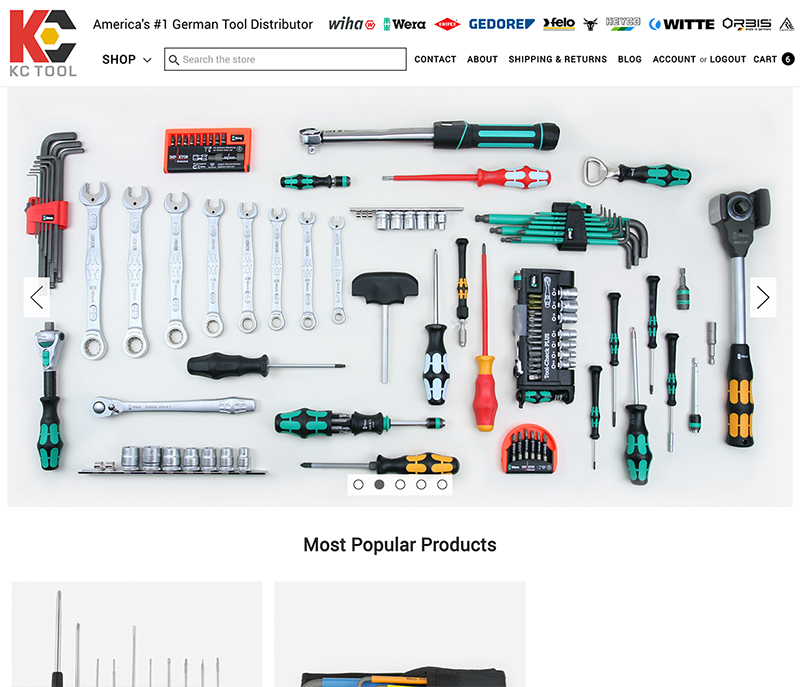
New Home Page Layout (desktop view)

beta-desktop.jpg


New Home Page Layout (mobile view)

beta-mobile.jpg
 
Last edited:
To avoid these ads, REGISTER NOW!

Gautama

Well-known member
Joined
Aug 14, 2016
Messages
131
I spent some time going through the new site, and it looks great! I actually discovered some new tools I want. Nice work!
 

jeejay

Well-known member
Joined
Jun 20, 2016
Messages
465
Better than The Home Depot. Those snobs are requiring that I buy a new operating system to browse their site or redeem rebates. As far as I'm concerned, they now have no online presence (and they had a lot of things not sold in their stores, so that's all out the window).
 
Last edited:

gdocktor3

Well-known member
Joined
Apr 18, 2015
Messages
5,419
Location
Connecticut
Better than The Home Depot. Those snobs are requiring that I buy a new operating system to browse their site or redeem rebates. As far as I'm concerned, they now have no online presence (and they had a lot of things not sold in their stores, so that's all out the window).

What are you using Windows 98???
 

jeejay

Well-known member
Joined
Jun 20, 2016
Messages
465
No, it worked fine up until this year, like every other site still does, so it's on their end (they just had to make their logo spin or something, I'll never know... the whole format comes out like it was put through blender, so I can't see a thing). Then they have a message that the newest browser possible for my OS has to be upgraded to redeem a rebate, so I'll ignore anything they sell involving one. It just isn't worth the trouble.

I don't go there as often either, because they'll close an isle mid-way to offload something from a shelf on the next isle (which takes them at least a half hour), and they have the hardware separated to make you walk back and forth down its whole length to find different things in the same size, so I'm in the middle of this silly scavenger hunt, then turn around and it's freaking closed (without warning). I just tossed the hardware down it and walked out (well, at least I put things in the proper place if someone else was waiting to look).
 
Last edited:

a52-830

Well-known member
Joined
May 28, 2016
Messages
4,644
Location
north of boston, massachusetts
it is pretty good. i would suggest two things:

dont get lost down the fancy graphics rathole. the big sliding banner at the top is OK, but i hate waiting for a site to load all that stuff. yours is fine now, but if you dont pay attention, or get really busy . . . . i go there to buy tools.

dont feature things on your front page when you dont have images for them. honestly, it looks stupid that there are these "new things" that you can't show me.


clutter is your enemy on a web page. too much ****, and important things get lost.

"Perfection is Achieved Not When There Is Nothing More to Add, But When There Is Nothing Left to Take Away" - Antoine de Saint-Exupery
 

mhejl

Well-known member
Joined
Aug 7, 2015
Messages
328
Location
DFW Texas
First thing I don't like: where the hell is the "tool of the day"?!? That's the FIRST thing I hit on your old site. Don't like "new products" with no images, either - tacky. I don't give a rats *** about "most popular", either - too much real estate for that. Optimizing for phone/tablet is just so wrong but, hey, I'm a retro-grouch (even though I've been a code-slinger since ~1975).

I do like that you FINALLY link Witte on the main page, though - but it is missing on the top scrollable frame? Fail.

Overall, I like the old home page better - much easier to navigate with the "tool types" frame on the main page rather than buried in a "shop" drop-down. Oh, that's wheer "tool of the day" is now! Just put Witte on the old home page.
 

jeejay

Well-known member
Joined
Jun 20, 2016
Messages
465
I'm not part of the sunshine band (unless you'd quoted me to illustrate highlighting something out of place). :dunno: That's another reason I don't go to HD often, they're always playing b-side disco music. Who the hell wants to be in that mood? Unless I'm at a thrift store looking for bell bottoms... yeah I can tolerate it, but whyyyyyyyyyyyyyyyyyyyyyyyy :pimpflash are they calling me a tool or something?
JuqPmehMZ33rE7weqs5m5dJ2.jpeg
 
Last edited:

Davefr

Well-known member
Joined
Jan 7, 2010
Messages
11,815
Location
OR
1. I'd change "Shop" to "Products" at the top of the page. It took me a few moments to find where product categories were listed. (I start by shopping products first and then brands.)

2. Add a shopping cart icon instead of "Cart"

3. Add your toll free number at the bottom of the page under "info"

4. I don't like things moving on a website but maybe it's me. The big rolling cluttered tool brand displays gave me a headache.

5. Your actual product pages are excellent. Nice big detailed images, description, availability, COO and drill down filters.

6. I also like the fact that you list USPS shipping options. Nothing worse then going thru a "pretend" order placement then finding out a supplier ships via uncompetitive UPS rates on small items.

In summary, I'd work on the home page to make it simpler and less cluttered. After you get past the home page everything is excellent.

Remember, what makes a good opening home page a great home page is not what you add, but what you remove.
 

Gautama

Well-known member
Joined
Aug 14, 2016
Messages
131
Speaking as a former designer (almost 20 years), asking people what they think of a design is an error only exceeded by implementing what they suggest. :)
 

rrich1

Well-known member
Joined
Oct 7, 2015
Messages
793
My main complaint I have is the the website dictating how many items I can view per page. The original had it (up to 330 items) but this one doesnt. Put that back please.
 

winlinmac

Well-known member
Joined
Aug 17, 2015
Messages
3,742
Location
USA
Have all accounts been transitioned to the new site?
Also, I noticed that COO for one of Wera's Screwdriver Sets were made in Germany. Aren't they all Made in Czech Republic? :confused:

Awesome template by the way :beer:
 
Last edited:

Roobaix

Well-known member
Joined
Mar 3, 2016
Messages
255
Location
White Plains, NY
I'm good with it.

I'd like to be able to view more items per page. I much prefer to just keep scrolling down than have to constantly click on the next page.

Tool of the Day was easy to find under "Shop"
800 number was under Contact, right where I'd expect it to be
 

pistolpete1313

Well-known member
Joined
Sep 17, 2013
Messages
182
Location
Fort Collins, CO
I always liked the vine videos and I know it's a database nightmare but he more a blank product image can be avoided the better.

It was good before, glad that's it's improving!
 
Joined
Aug 11, 2016
Messages
18
Location
Northwest South Dakota
Took me a couple of minutes to find the "Menu" under the "SHOP" dropdown. Make it more obvious that that is where to go to browse 'pliers' for example. It is not obvious where that is right now, and should be.
 

65k10

Well-known member
Joined
Jul 25, 2016
Messages
619
Location
somewhere
The site looks good to me. Fairly intuitive to navigate and as another member said, being able to view multiple shipping options from the cart is always appreciated.

My only nitpics would be the "Shop" icon, could be a bit more obvious and being able to select how many items I want to see on one page is nice. It can get annoying having to go through multiple pages when browsing.
 
To avoid these ads, REGISTER NOW!

M6erfan

Well-known member
Joined
Dec 6, 2014
Messages
10,170
Location
'Merica!
My main complaint I have is the the website dictating how many items I can view per page. The original had it (up to 330 items) but this one doesnt. Put that back please.

+1

Or do a "show all" option. Looks good to me, other than this
 

firworks

Well-known member
Joined
Jun 29, 2015
Messages
4,079
Location
IL
I like it but coupon codes don't seem to be working. Tried the alliance discount and it said it could not be applied. Went to the regular KC website and it worked.
 

Farmall450

Well-known member
Joined
Dec 23, 2011
Messages
13,354
Location
Marengo, Illinois
The site looks good to me. Fairly intuitive to navigate and as another member said, being able to view multiple shipping options from the cart is always appreciated.

My only nitpics would be the "Shop" icon, could be a bit more obvious and being able to select how many items I want to see on one page is nice. It can get annoying having to go through multiple pages when browsing.

Ditto, maybe its placement doesn't help matters much either.
 
OP
K

KCT_Jordan

Well-known member
Joined
Jul 24, 2014
Messages
76
Location
Olathe, KS, USA
Thank you everyone for the positive feedback and constructive criticism.

Stay tuned for tweaks, changes, and improvements.

If you have any website related questions/concerns/feedback please email our webmaster at feedback(at)kctoolco(dot)com
 

ChaseDE

Well-known member
Joined
Aug 25, 2016
Messages
2,178
Location
Delaware
BigCommerce is a great platform to use, very secure and always updated by their team. I use BC for all my ecom clients. The site and template look good to me, I like the loading bar on top.

Moving away from volusion is a good choice, never liked it. Good luck with the new one!
 

roemaster

Member
Joined
Sep 19, 2016
Messages
20
Do you have a physical store front? I live in Olathe.

We sure do. Stop in and see us. Would love to have ya come by.

19939 W. 160th St
Olathe KS 66062

Just north of the dairy farm on State Highway 169 and 162nd St.
 

openwheelracing88

Well-known member
Joined
Nov 10, 2015
Messages
266
made my first order over the weekend and I like the layout. My suggestions:

1. update the pictures. Some pics are obvious incorrect.
2. short videos could be more useful.
3. More options to sort my searches.
 
To avoid these ads, REGISTER NOW!
Top Bottom