

You are using an out of date browser. It may not display this or other websites correctly.
You should upgrade or use an alternative browser.
You should upgrade or use an alternative browser.
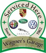
My Garage sign
- Thread starter sarel.wagner
- Start date

OP
sarel.wagner
Well-known member

rwhite692
Well-known member
Since you are posting it I'm guessing you are soliciting opinions on it....
I dunno...looks like the quality seal for a canned ham, or something.
I dunno...looks like the quality seal for a canned ham, or something.
JCQuick
Well-known member
nice sign but beware VWOA does not take kindly to unautherized use of thier emblem.
OP
sarel.wagner
Well-known member
No I wasn't actually, but thanx anyhow. Just looking for the GJ logo to add in here.... or to a modified version.
Rgrds
Rgrds
I have been designing signs and architectural signage for 20 years and although your layout is traditional, I would recommend either dropping the white outline around the letters or pick a fatter letter style. The outline and thin letters blurs the copy to much for such a small sign.
If you plan on just printing your sign, I would separate your elements with a drop shadow or even print it in different layers and have a dimensional sign. Either way, nice job!
If you plan on just printing your sign, I would separate your elements with a drop shadow or even print it in different layers and have a dimensional sign. Either way, nice job!
ZRX61
Well-known member
My constructive criticism: Seems to look a little like something you pulled from Word Clipart.
Was thnking it looked a bit 'micro brewery" rather than auto related myself
OP
sarel.wagner
Well-known member
Thanx guys, appreciate the comments, will look at it again and change a few things.
Rgrds
Rgrds
e-tek
Well-known member
Since you are posting it I'm guessing you are soliciting opinions on it....
I dunno...looks like the quality seal for a canned ham, or something.
I don't see where he asked for opinions on it.....especially if uuuhhh, you, dunno.....
OP
sarel.wagner
Well-known member
I don't see where he asked for opinions on it.....especially if uuuhhh, you, dunno.....
Don't sweat it
 its only a sign
 ") I can change it, maybe a good thing too...
I can change it, maybe a good thing too...To be printed or vinyl cut or maybe a combination in A3 size.
Rgrds
e-tek
Well-known member
Don't sweat it
To be printed or vinyl cut or maybe a combination in A3 size.
Rgrds
I try to stick to the main rule of the site: "If you can't say something nice, say nothing at all!"

Hmmm, which then goes against what I said doesn't it.....d'oh!

rockchucker
Well-known member
Maybe take out the "These Brands" from the "These Brands Serviced Here" and you will be able to just go with "Serviced Here". This will give you a larger letter size and a more defined font.
Usually if you are displaying something on line regardless of whether or not you want peoples opinions you will get them. Constructive Criticism can sometimes really help people out. I am not a huge fan of the style of the sign but I would not hesitate on stating my opinion on the matter.
Usually if you are displaying something on line regardless of whether or not you want peoples opinions you will get them. Constructive Criticism can sometimes really help people out. I am not a huge fan of the style of the sign but I would not hesitate on stating my opinion on the matter.
OP
sarel.wagner
Well-known member
porschedude996TT
Well-known member
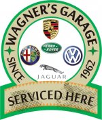
I like the revised one.
sammm
Well-known member
How about replacing 'Serviced Here' with 'Wagner's Garage' and remove the extra banner at the bottom..... I like it better than the first one.
PS
The 'Serviced Here' font looks bigger than 'Wagners Garage'
PS
The 'Serviced Here' font looks bigger than 'Wagners Garage'
Motofixxer
Well-known member
- Joined
- Oct 10, 2009
- Messages
- 681
Well since we are sharing opinions, I will chime in. I don't really care much for it. The revised is better though it's clearer and less wordy. They look too traditional for my taste. I like something that stands out more. Like what you ask??? I don't know I'm not creative in that sense. But if that's your choices, go with the second. Or consider color changes.
vette-kid
Well-known member
I kinda like em both I think it would make a pretty cool addition to my garage too! Any chance you are offering up the service for garage journal members?
I think it would make a pretty cool addition to my garage too! Any chance you are offering up the service for garage journal members?rockchucker
Well-known member
Muuuuuch better IMO. I also would like to see an all caps Font used instead of lowercase letters. Especially on the "Serviced Here" part and "Since 1962". This will stand out more and since '62 was a ways back you don't want to look too fancy because the older generation is used to more simple less frilly ads. Especially for Automotive shops. A lot of the younger Generation is going to ask their Dad where to take their car probably. Sell it to the Dad and the siblings will follow. Too fancy leads to looking cheap.
You could do kind of an older style flag in the wind banner type of background for the "Wagner's Garage" instead of the Postal Stamp looking cut-out too. Almost more of a Family Crest or Seal looking style. Then it kind of convey's a message of Family too. since you have been there for a few years now it is reassuring that you will be around for a while.
Again... just my .o2 on the matter.
54FordPanel
Well-known member
I try to stick to the main rule of the site: "If you can't say something nice, say nothing at all!"
Well, that would free up alot of bandwidth, wouldn't it?
I also like the revised logo much better than the 1st one.
hilld
Well-known member
I think you are missing the Audi logo. If you are already working on VW's, you might as well work on Audi's as they are from the same company, use the same diagnostic tools and Audi's cost more, so the owners might have a little more money.
Just saying.
Derek
Just saying.
Derek
rikmeister
Well-known member
i like it but change the green colour to blue and you have a winner.
OP
sarel.wagner
Well-known member
I kinda like em both
Sorry but this is only a once off design thing, for fun only

Rgrds
OP
sarel.wagner
Well-known member
sammerdog
Banned
Good job! The revised version has a good look to it.
One problem - when I clicked on the photo to see it larger, my speakers turned on and I could hear those dang vuvuzelas in the background.
One problem - when I clicked on the photo to see it larger, my speakers turned on and I could hear those dang vuvuzelas in the background.
OP
sarel.wagner
Well-known member
Good job! The revised version has a good look to it.
One problem - when I clicked on the photo to see it larger, my speakers turned on and I could hear those dang vuvuzelas in the background.
 those things are a scourge!! Damn well hate them!!
Thanx fot your comments
Rgrds
71Datsun510Wagon
Well-known member
My final version me thinks?
Rgrds
Very nice work all around.
I'd add this in:

.... Hopefully the wife/GF has a sense of humour!

Rob
38 Special
Well-known member
Very nice work all around.
I'd add this in:
.... Hopefully the wife/GF has a sense of humour!
Rob
Perhaps add the trucker girl from chains form the 'Serviced here".
Nice sign.