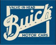
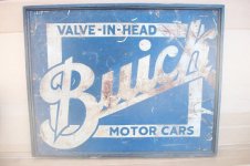
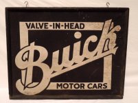
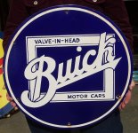
Hey gazza, I can appreciate your frustration of " "reprodudtions" of logos that are reproduced incorrectly". BUT I assure you I am trying to be as authentic in this build AND with the creation of this sign as is practically possible. I am very familiar with Buick signage from the early years and the logo I used for this sign is the upper portion of one of the oldest Buick Motor Car ads I know of (with the early Buick logo of "If It Isn't Valve in Head, It Isn't A Buick" . My Buick Sales and Service Garage build is designed around buildings typically seen in the 1920s, some generating from old livery stables. Therefore I used an old ad from 1915 for the base of my sign. Signs of that period were often hand painted directly on buildings and varied quite a bit from the actual dealership signs purchased from the motor companies. Some of the signs were painted by local sign painters with the owners names included etc. I feel very comfortable using the one I am using and it works for me. Just so you know I did investigate and seek out the most original style that would work for me I'm also posting a few others I considered taking from, and did not just grab the first repro from ebay I came across.
I have a great appreciation of sign painters and "signwriters" and realize it is a dying art. As I said I appreciate where you are coming from but hope you now realize where I am coming from also.
")


 Thanks rieferman
