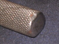
I just found a 3/8" ratchet with this logo design over the weekend. Selector knob looks machined rather than forged like this one. Will get it cleaned and serviced and pics posted soon!We also ran across a 1/2” drive ratchet.
-Don

You are using an out of date browser. It may not display this or other websites correctly.
You should upgrade or use an alternative browser.
You should upgrade or use an alternative browser.
Vintage S-K Tools
- Thread starter lzenglish
- Start date


d42jeep
Well-known member
Probably in the neighborhood of 1986. 
-Don
-Don
Upstater57
ALLIANCE MEMBER


Here is a pristine, brand new, all Wayne 1/2 inch 1/4 inch combo set I have on hand. Does anyone know what years SK did the blue sets?
d42jeep
Well-known member
I can’t see from your pictures if the sockets are knurled or not. Earlier Wayne sockets (1964) are knurled, later on they discontinued the knurling and went to the two groove sockets.
 According to AA, S-K Wayne marked tool were made from ‘64 to ‘69.
-Don
According to AA, S-K Wayne marked tool were made from ‘64 to ‘69.-Don
Last edited:
Oldtuleguy
Well-known member
- Joined
- Nov 4, 2017
- Messages
- 10,460
I've heard the blue sets were holiday specials
Outlawmws
Well-known member
I've heard the blue sets were holiday specials
Seems like an "internet rumor/theory" to me...
Upstater57
ALLIANCE MEMBER


Don,
I appreciate the follow up. In this set, the 1/2 inch drive sockets are knurled and the 1/4 sockets have the two grooves. All the components including the 13/16 spark plug socket have the SK Wayne nomenclature on them. It is interesting that this set has both. The other mystery is when they used the blue box. I have been trying to find a catalog showing the blue box sets but have not found one thus far.
Ed
Outlawmws
Well-known member
I don't think Symington-Wayne was selling boxes of tools prior to the SK acquisition? but were there other product/corp colors blue?
d42jeep
Well-known member
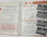
Your questions have caused me to look into the Wayne era more than I have in the past. I am of the belief that most all of the sets in blue boxes that have been found were made during Wayne ownership. It gets a little confusing because Wayne continued to sell S-K marked tools from ‘62 to ‘63, finally adding Wayne to the markings in ‘64. The 1962 S-K/Lectrolite catalog states that those two companies are subsidiaries of Wayne. 
That accounts for my blue S-K Lectrolite boxes.

It probably accounts for the blue S-K boxes likely made in 1963.
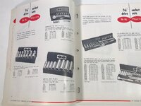
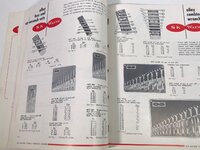
 Since most of the photography in the Wayne catalogs is black and white, it’s difficult to determine the colors of the boxes but they show your two styles of sockets together in 1966. My best guess is that would be the timeframe when your set was made.

-Don
That accounts for my blue S-K Lectrolite boxes.
It probably accounts for the blue S-K boxes likely made in 1963.
Since most of the photography in the Wayne catalogs is black and white, it’s difficult to determine the colors of the boxes but they show your two styles of sockets together in 1966. My best guess is that would be the timeframe when your set was made.-Don
Outlawmws
Well-known member
But the color covers are blue... were not the earlier SK cover colors green?
d42jeep
Well-known member
Most all S-K sets made before the Wayne buyout in 1962 were green. Blue is a common color for S-K Wayne sets. Here are some current eBay listings for Wayne sets. 


-Don
-Don
Upstater57
ALLIANCE MEMBER
Don,Most all S-K sets made before the Wayne buyout in 1962 were green. Blue is a common color for S-K Wayne sets. Here are some current eBay listings for Wayne sets.
-Don
I appreciate all your work on this. I have some SK Wayne nameplates on green boxes. They probably started the blue as they used up the green box inventory.
Unrelated, and as an FYI, I will be posting some pictures of a couple of 3D printed SK tray inserts by the end of next week. I had a couple of NOS ones scanned. I will post the pics side by side so we can see if reproduction trays can pass muster.
Ed
Upstater57
ALLIANCE MEMBER
I was reading that the Kraeuter tool company became part of SK Wayne somewhere around 1964. Kraeuter was a plier company and blue was a color they used for some of the grips on their pliers much like Utica Tool used black of their plier handles. I have some NOS Utica Pliers with black handles. SK Wayne did make blue boxed Kraeuter socket sets in the 1960s. Kraeuter made a lineman plier called the dreadnaught. It had decorative handles and originally used nickel steel in the early 1900's. Who knows if Kraeuter tool influence led to the SK Wayne blue box.
d42jeep
Well-known member


Outlawmws
Well-known member
All those things you never knew existed and now desperately need...I'm blinded by all the eye-candy, guys! Please stop! lol
I feel my wallet vibrating already!All those things you never knew existed and now desperately need...

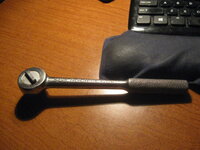
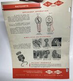
Here's the 3/8" incher I found. Thoroughly cleaned and lubed with RLL - works great.I just found a 3/8" ratchet with this logo design over the weekend. Selector knob looks machined rather than forged like this one. Will get it cleaned and serviced and pics posted soon!
Some teeth wear, finish and knurling 90%+ intact, some chrome darkening. Gonna put it into the rotation.
Attachments

d42jeep
Well-known member
With the early patent number that ratchet is possibly prewar or with the darker finish remaining likely from WW2.
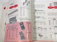
Going through the S-K storage boxes today, I took some pictures of pliers and screwdrivers.

-Don
Going through the S-K storage boxes today, I took some pictures of pliers and screwdrivers.
-Don
four.cycle
Well-known member
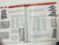
^ As noted by Don, ALL of S-K's catalogs show black and white photograph images of the boxes, so it's rather difficult to make any sort of timeline on color. I just scrolled through the folder, and the first color image I have is a 1969 S-K magazine ad which shows the green boxes most of us are familiar with.
Everything during the S-K-Lectrolite-Wayne period is all black-and-white.
Everything during the S-K-Lectrolite-Wayne period is all black-and-white.
Attachments

Outlawmws
Well-known member
As noted by Don, ALL of S-K's catalogs show black and white photograph images of the boxes
What about cover color? That generally shows corporate colors? Borders or title text?
My experience with corp marketing has always been they are pretty tight about a lot of things meeting "the corporate specs". VISA had possibly the tightest directives for color coordination I ever saw, and day one I was handed a "template power point" outlining every aspect that had to be followed religiously.
Ford has their "Ford Blue" oval, Channellock has trademarked CL blue. many, if not most companies are tight about such.
One company I contracted at was having a new sign put up at their HQ. The CEO drives up and sees the sign on a truck waiting for a crane. She stopped, introduced herself and told them to take the sign back and make it the correct color shade as it was off. Then damn near fired them on the spot when the foreman tried to convince her to accept it "as is" - It went back and a week later the new sign with the exact color shade was installed...
Even the last company I retired from, effectively a start up, had tight standards for what was acceptable for colors, fonts and anything that represented them. Colors changed at least 4 times in the 6 years I was there.
I would expect SK & Symington/Wayne to be equally tight.
Upstater57
ALLIANCE MEMBER
Brand management is directly tied to colors. In my 45 years of corporate management experience i found this to be 100% true.What about cover color? That generally shows corporate colors? Borders or title text?
My experience with corp marketing has always been they are pretty tight about a lot of things meeting "the corporate specs". VISA had possibly the tightest directives for color coordination I ever saw, and day one I was handed a "template power point" outlining every aspect that had to be followed religiously.
Ford has their "Ford Blue" oval, Channellock has trademarked CL blue. many, if not most companies are tight about such.
One company I contracted at was having a new sign put up at their HQ. The CEO drives up and sees the sign on a truck waiting for a crane. She stopped, introduced herself and told them to take the sign back and make it the correct color shade as it was off. Then damn near fired them on the spot when the foreman tried to convince her to accept it "as is" - It went back and a week later the new sign with the exact color shade was installed...
Even the last company I retired from, effectively a start up, had tight standards for what was acceptable for colors, fonts and anything that represented them. Colors changed at least 4 times in the 6 years I was there.
I would expect SK & Symington/Wayne to be equally tight.
four.cycle
Well-known member
Attachments
-
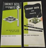
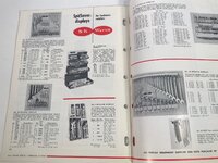
 1950s S-K Socket Sets and Parts brochure pp 12.jpg505.1 KB · Views: 11
 -
 1950s S-K Socket Sets and Parts brochure pp 12..jpg526 KB · Views: 5
 -
 1950s S-K Socket Sets and Parts brochure pp 8-9.jpg460.4 KB · Views: 5
 -
 1950s S-K Socket Sets and Parts brochure pp 6-7.jpg451.3 KB · Views: 5
 -
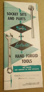
 1950s S-K Socket Sets and Parts brochure front cover.jpg451.5 KB · Views: 6
 -
 1950s S-K socket set brochure pp d.jpg256.4 KB · Views: 6
 -
 1950s S-K socket set brochure pp c.jpg354.7 KB · Views: 6
 -
 1950s S-K socket set brochure pp b.jpg251.5 KB · Views: 4
 -
 1950s S-K socket set brochure pp a.jpg208.2 KB · Views: 4
 -
 1950s S-K socket set brochure front cover.jpg277.5 KB · Views: 4
Last edited:
four.cycle
Well-known member
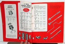
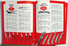
S-K Tools
1950s advertising brochure
1951 wholesale hardware catalog advertisements
S-K at International Tool Catalog Library
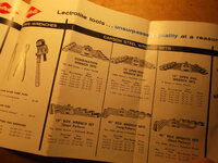
1950s advertising brochure
1951 wholesale hardware catalog advertisements
S-K at International Tool Catalog Library
Attachments
-
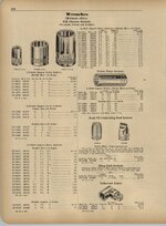
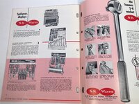
 1950s S-K Socket Sets and Parts brochure pp 35-36.jpg402.1 KB · Views: 5
 -
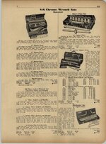
 1951 S-K Sherman Klove catalog ad pp 310.jpg573.2 KB · Views: 4
 -
 1951 S-K Sherman Klove catalog ad pp 311.jpg647.1 KB · Views: 4
 -
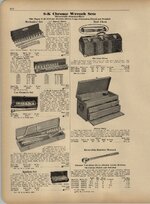
 1951 S-K Sherman Klove catalog ad pp 312.jpg620.8 KB · Views: 4
 -
 1951 S-K Sherman Klove catalog ad pp 313.jpg634.6 KB · Views: 4
 -
 1951 S-K Sherman Klove catalog ad pp 314.jpg604.4 KB · Views: 4
 -
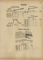 1951 S-K Sherman Klove catalog ad pp 315.jpg488.5 KB · Views: 6
Last edited:
four.cycle
Well-known member
Attachments


Last edited:
four.cycle
Well-known member
Attachments
-
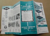
 1958 S-K Lectrolite Catalog No. 958 front cover.jpg621 KB · Views: 4
 -
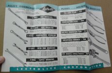
 1958 S-K Lectrolite Catalog No. 958 pp a.jpg565.2 KB · Views: 4
 -
 1958 S-K Lectrolite Catalog No. 958 pp b.jpg506.2 KB · Views: 3
 -
 1958 S-K Lectrolite Catalog No. 958 pp c.jpg584.3 KB · Views: 3
 -
 1958 S-K Lectrolite Catalog No. 958 pp d.jpg641.4 KB · Views: 2
 -
 1958 S-K Lectrolite Catalog No. 958 pp e.jpg583.7 KB · Views: 2
 -
 1958 S-K Lectrolite Catalog No. 958 pp f.jpg596.2 KB · Views: 3
Last edited:
four.cycle
Well-known member
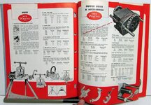
S-K Tools
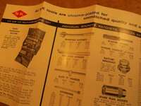
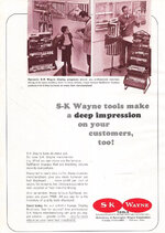
1960s S-K Wayne advertisement
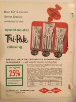
1961 S-K Lectrolite advertisement
1961 S-K Lectrolite catalog
S-K at International Tool Catalog Library
1960s S-K Wayne advertisement
1961 S-K Lectrolite advertisement
1961 S-K Lectrolite catalog
S-K at International Tool Catalog Library
Attachments
-
 1960s S-K Wayne ad pp.jpg416.6 KB · Views: 3
 -
 1961 S-K Lectrolite ad pp.jpg395.7 KB · Views: 3
 -
 1961 S-K Lectrolite catalog MC361 front cover.jpg428.9 KB · Views: 3
 -
 1961 S-K Lectrolite catalog MC361 pp 2.jpg317.2 KB · Views: 3
 -
 1961 S-K Lectrolite catalog MC361 pp 3.jpg341.1 KB · Views: 3
 -
 1961 S-K Lectrolite catalog MC361 pp 4.jpg368.2 KB · Views: 3
 -
 1961 S-K Lectrolite catalog MC361 pp 5.jpg356 KB · Views: 3
Last edited:
four.cycle
Well-known member
Attachments
-
 1961 S-K tool catalog detail 01.jpg389.8 KB · Views: 3
 -
 1961 S-K tool catalog detail 02.jpg427.6 KB · Views: 3
 -
 1961 S-K tool catalog detail 03.jpg376.1 KB · Views: 3
 -
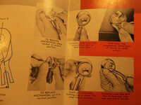 1961 S-K tool catalog detail 04.jpg417.6 KB · Views: 3
 -
 1961 S-K tool catalog detail 05.jpg397.3 KB · Views: 3
 -
 1961 S-K tool catalog detail 06.jpg355.2 KB · Views: 3
 -
 1961 S-K tool catalog detail 07.jpg392.8 KB · Views: 3
 -
 1961 S-K tool catalog front cover.jpg332.6 KB · Views: 3
 -
 1961 S-K tool catalog rear cover.jpg340.7 KB · Views: 3
Last edited:
four.cycle
Well-known member
Attachments


Last edited:
four.cycle
Well-known member
S-K Tools
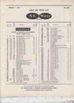
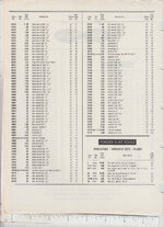
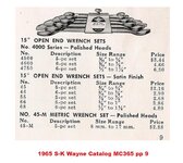
1965 S-K Wayne Lectrolite advertisements price list
S-K at International Tool Catalog Library
1965 S-K Wayne Lectrolite advertisements price list
S-K at International Tool Catalog Library
Attachments
Last edited:
four.cycle
Well-known member
Attachments


Last edited:
four.cycle
Well-known member
Attachments
-
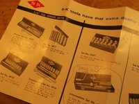
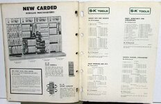
 1966 S-K Wayne catalog No. 90136 front cover.jpg173.5 KB · Views: 1
 -
 1966 S-K Wayne catalog No. 90136 pp 1.jpg296.5 KB · Views: 1
 -
 1966 S-K Wayne catalog No. 90136 pp 2-3.jpg245.6 KB · Views: 1
 -
 1966 S-K Wayne catalog No. 90136 pp 8.jpg259.8 KB · Views: 1
 -
 1966 S-K Wayne catalog No. 90136 pp 10.jpg250.5 KB · Views: 1
 -
 1966 S-K Wayne catalog No. 90136 pp 14.jpg270.3 KB · Views: 1
 -
 1966 S-K Wayne catalog No. 90136 pp 18.jpg278.7 KB · Views: 1
 -
 1966 S-K Wayne catalog No. 90136 pp 34.jpg326.1 KB · Views: 1
 -
 1966 S-K Wayne catalog No. 90136 pp 36.jpg318.4 KB · Views: 1
 -
 1966 S-K Wayne catalog No. 90136 rear cover.jpg266.1 KB · Views: 2
Last edited:
four.cycle
Well-known member
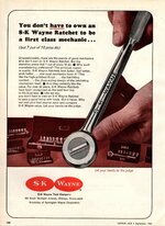
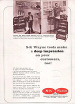
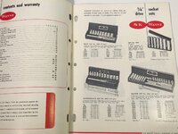
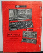
S-K Tools
1967 S-K Tool advertisement
1968 S-K Wayne catalog
S-K at International Tool Catalog Library
1967 S-K Tool advertisement
1968 S-K Wayne catalog
S-K at International Tool Catalog Library
Attachments
-
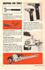 1967 Popular Mechanics Black & Decker Estwing Holub S-K Wayne ad pp 216.jpg372.8 KB · Views: 2
 -
 1968 S-K Tool Catalog No. 90118 front cover.jp.jpg526.6 KB · Views: 2
 -
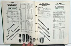
 1968 S-K Tool Catalog No. 90118 pp a.jpg114.5 KB · Views: 2
 -
 1968 S-K Tool Catalog No. 90118 pp c.jpg176 KB · Views: 2
 -
 1968 S-K Tool Catalog No. 90118 pp b.jpg155.4 KB · Views: 2
 -
 1968 S-K Tool Catalog No. 90118 pp d.jpg154.9 KB · Views: 5
 -
 1968 S-K Tool Catalog No. 90118 pp e.jpg165.9 KB · Views: 6
Last edited:
four.cycle
Well-known member
S-K Tools
1968 S-K Wayne catalog
undated S-K Wayne advertisement(form 665)
S-K at International Tool Catalog Library
1968 S-K Wayne catalog
undated S-K Wayne advertisement(form 665)
S-K at International Tool Catalog Library
Attachments
-
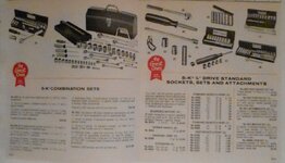
 1968 S-K Tool Catalog No. 90118 pp f.jpg154.2 KB · Views: 5
 -
 1968 S-K Tool Catalog No. 90118 pp g.jpg158.6 KB · Views: 3
 -
 1968 S-K Tool Catalog No. 90118 pp h.jpg172.3 KB · Views: 3
 -
 1968 S-K Tool Catalog No. 90118 pp j.jpg179.5 KB · Views: 2
 -
 1968 S-K Tool Catalog No. 90118 pp k.jpg188.4 KB · Views: 2
 -
 1968 S-K Tool Catalog No. 90118 rear cover.jpg317.4 KB · Views: 1
 -
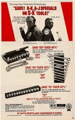
 S-K Wayne Autumn promotional flyer Form 665.jpg414.1 KB · Views: 1
Last edited:
four.cycle
Well-known member
S-K Tools
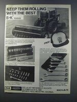
1969 S-K Wayne advertisement (see post #5301)
1969 S-K Dresser catalog
S-K at International Tool Catalog Library
1969 S-K Wayne advertisement (see post #5301)
1969 S-K Dresser catalog
S-K at International Tool Catalog Library
Attachments
-
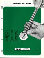 1969 S-K Dresser catalog No 91509 front cover.jpg238 KB · Views: 1
 -
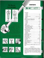 1969 S-K Dresser catalog No 91509 frontispiece.jpg318.4 KB · Views: 1
 -
 1969 S-K Dresser catalog No 91509 pp 1.jpg317.3 KB · Views: 1
 -
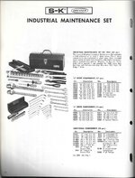 1969 S-K Dresser catalog No 91509 pp 20.jpg259.6 KB · Views: 1
 -
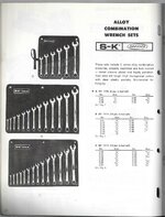 1969 S-K Dresser catalog No 91509 pp 22.jpg258.6 KB · Views: 1
 -
 1969 S-K Dresser catalog No 91509 pp 27.jpg252.1 KB · Views: 1
 -
 1969 S-K Dresser catalog No 91509 pp 29.jpg283.7 KB · Views: 1
 -
 1969 S-K Dresser catalog No 91509 pp 35.jpg341.7 KB · Views: 2
 -
 1969 S-K Dresser catalog No 91509 pp 39.jpg341.8 KB · Views: 2
 -
 1969 S-K Dresser catalog No 91509 rear cover.jpg317.9 KB · Views: 2
Last edited:
four.cycle
Well-known member
Attachments
-
 1969 S-K Tool Catalog No. 91109 front cover.jpg235 KB · Views: 1
 -
 1969 S-K Tool Catalog No. 91109 pp a.jpg127 KB · Views: 1
 -
 1969 S-K Tool Catalog No. 91109 pp b.jpg166.1 KB · Views: 1
 -
 1969 S-K Tool Catalog No. 91109 pp c.jpg154.7 KB · Views: 1
 -
 1969 S-K Tool Catalog No. 91109 pp d.jpg159.8 KB · Views: 1
 -
 1969 S-K Tool Catalog No. 91109 pp e.jpg180.8 KB · Views: 1
 -
 1969 S-K Tool Catalog No. 91109 pp f.jpg197.3 KB · Views: 1
 -
 1969 S-K Tool Catalog No. 91109 pp g.jpg181.1 KB · Views: 2
Last edited:
four.cycle
Well-known member
Attachments

Last edited:
four.cycle
Well-known member
S-K Tools
1971 S-K Tool advertisement
1973 S-K Dresser catalog
1975 S-K Tool advertisement
1976 S-K Tool advertisement
1978 S-K Tool advertisement
1979 S-K Tool advertisement
1981 S-K Tool advertisement
S-K at International Tool Catalog Library
1971 S-K Tool advertisement
1973 S-K Dresser catalog
1975 S-K Tool advertisement
1976 S-K Tool advertisement
1978 S-K Tool advertisement
1979 S-K Tool advertisement
1981 S-K Tool advertisement
S-K at International Tool Catalog Library
Attachments
-
 1978 S-K Tool ad pp 95.jpg120.2 KB · Views: 2
 -
 1979 Car and Driver magazine S-K Tool Mario Andretti ad pp 156.jpg215.7 KB · Views: 2
 -
 1976 Popular Mechanics S-K Tool ad pp 190.jpg605.9 KB · Views: 2
 -
 1975 S-K Tool A.J. Foyt ad pp.jpg284.8 KB · Views: 2
 -
 1973 S-K Dresser catalog pp c.jpg346.8 KB · Views: 2
 -
 1973 S-K Dresser catalog pp b.jpg339.7 KB · Views: 1
 -
 1973 S-K Dresser catalog pp a.jpg316 KB · Views: 1
 -
 1973 S-K Dresser catalog front cover.jpg378.2 KB · Views: 1
 -
 1971 Motor Trend S-K ad pp 112-113.JPG587.4 KB · Views: 1
 -
 1981 S-K Tool ad.jpg52.7 KB · Views: 1
Last edited:
d42jeep
Well-known member
Thanks for doing all of that work. Not much indication of toolbox colors on those covers. I did the same thing although I was much less thorough. 


-Don
-Don