To avoid these ads, REGISTER NOW!

What's with these design elements?!

Ryan

Administrator
Staff member
Joined
Jan 26, 2006
Messages
5,732
Location
Texas/Hawaii
I need to test a few parameters and figured I would do so with a quick explanation of a few new design related things around here. So, let's get started...

1. The Sans-Serif Font. When I was at OU, I took a typography class. For my final project, I decided to digitize a font that wasn't available yet. So, I took what was considered the most readable font in the world (at the time) and rebuilt it in fontographer. It's now called "Interstate", is available commercially, and is used on all highway signs in the United States.

2. The Lion. When my great grandfather applied for his first patent (Cochran Speednut), his logo featured a little lion. The lion you see here is a modern interpretation of that logo:

lion.png
3. The background. It just looks like grit, right? I wanted some age to this thing... So I took a bunch of illustrations from my grandfather's patent applications (borrowed a few others) and came up with a simple pattern:

tools.jpg

If you look closely, you can see some details of those applications... Not all are his, but most...
 
To avoid these ads, REGISTER NOW!

bradpac

Well-known member
Joined
Sep 8, 2013
Messages
721
Location
Central TX
The reason why this site is a success and a home for a lot of people is because of things like this. You didn't just pick some random images because they looked cool or studies showed they would bring in the most hits, they have a connection to you and a story, and they look cool.

I hope you are proud of everything you have built here because it certainly is an amazing achievement.
 

4xdog

Well-known member
Joined
Aug 18, 2012
Messages
5,634
Location
Santa Fe, NM
I love the background art, Ryan. It's terrific. And as a fan of typography (go figure -- a career as a paper scientist...) the current typeface looks just fine -- and a lot better than the serif font the site went live with.

The old garage building will be missed a bit. I gotta see if the next time I get out to Bryce Canyon National Park if that real one is still standing on the lonely roads of rural Utah...
i-RfCgftd-X5.jpg
 

dwasifar

Well-known member
Joined
May 28, 2017
Messages
2,101
1. The Sans-Serif Font. When I was at OU, I took a typography class. For my final project, I decided to digitize a font that wasn't available yet. So, I took what was considered the most readable font in the world (at the time) and rebuilt it in fontographer. It's now called "Interstate", is available commercially, and is used on all highway signs in the United States.
It's a good choice. I happen to know a few more details about this font, so I might as well share.

The official name of the font family is FHWA Series fonts, and they date to 1948, although they've been revised a bit since. I think the version being used here corresponds to FHWA Series C, the third-narrowest of the six widths available. Informally they were known as Highway Gothic before the creation of the clone font called Interstate.

Although they have been and currently are the standard for US road signs, there was a period starting in 2004 when road signs used a different font called Clearview. That didn't last, but you will still occasionally see signs in Clearview.
 
Last edited:

zmotorsports

ALLIANCE MEMBER
Joined
Oct 20, 2009
Messages
21,497
Location
Northern Utah
I like the background and thanks for the explanation Ryan. I like them even more now because they have a bond and I can relate as I feel the same way about things. I still have copies of old owner's manuals and service manuals that my dad and my mentor had as it has their handwriting in them which I still enjoy looking at. Not the greatest handwriting but opening an manual and seeing their notes still gives me that connected feeling.
 
OP
R

Ryan

Administrator
Staff member
Joined
Jan 26, 2006
Messages
5,732
Location
Texas/Hawaii
It's a good choice. I happen to know a few more details about this font, so I might as well share.

The official name of the font family is FHWA Series fonts, and they date to 1948, although they've been revised a bit since. I think the version being used here corresponds to FHWA Series C, the third-narrowest of the six widths available. Informally they were known as Highway Gothic before the creation of the clone font called Interstate.

Although they have been and currently are the standard for US road signs, there was a period starting in 2004 when road signs used a different font called Clearview. That didn't last, but you will still occasionally see signs in Clearview.

100% correct. I was the first to digitize it. Of course, I did it using computers at the University of Oklahoma, so the IP belonged to them. Through Dr. Fears, we were able to distribute it to government agencies. My digitization is what they use to cut the vinyl for the signs... Again, I didn't design or create anything... I just made it digital...

A few years after, someone leaked the font file. It was picked up by a font house, reworked a bit, and named "Interstate."
 

dwasifar

Well-known member
Joined
May 28, 2017
Messages
2,101
100% correct. I was the first to digitize it. Of course, I did it using computers at the University of Oklahoma, so the IP belonged to them. Through Dr. Fears, we were able to distribute it to government agencies. My digitization is what they use to cut the vinyl for the signs... Again, I didn't design or create anything... I just made it digital...

A few years after, someone leaked the font file. It was picked up by a font house, reworked a bit, and named "Interstate."
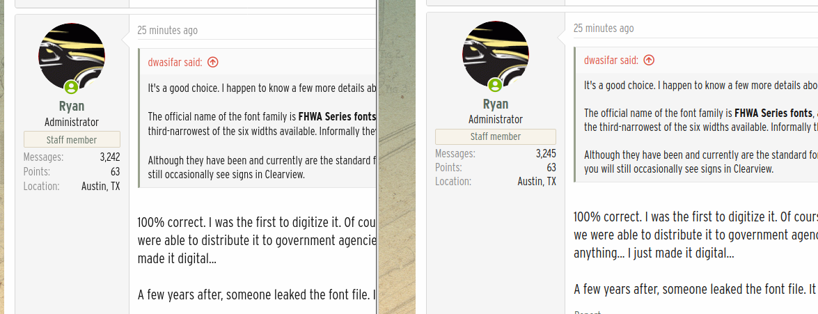
Interestingly, it renders differently across different browsers and platforms.

Here's Firefox (on the left) and Chrome (on the right) in Linux Mint:

font_rendering_linux.png


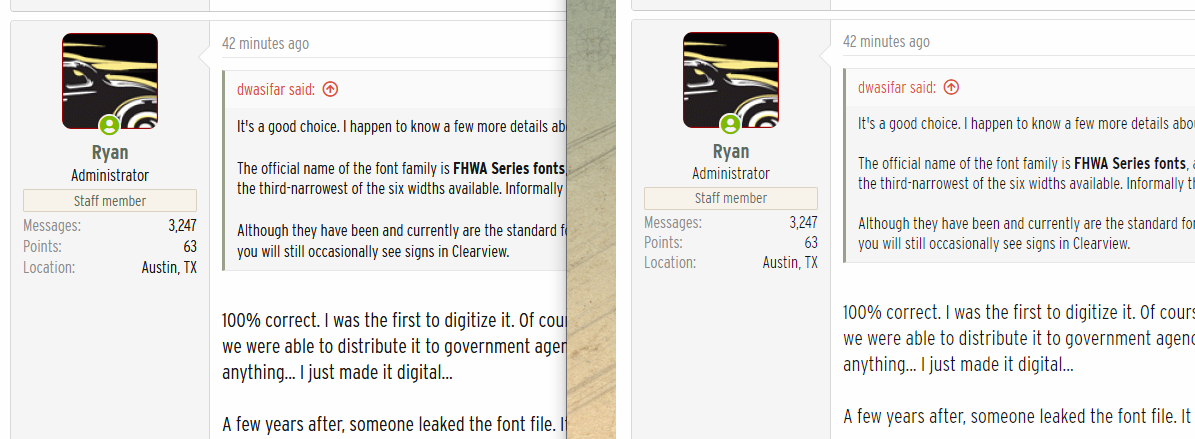
And in Windows 10:

font_rendering_windows.png


Firefox on Linux is the worst of the four, with nasty, jagged subpixel rendering errors. Firefox on Windows is better although oddly heavier, almost like a bold font. Chrome looks pretty consistent across platforms, although slightly better in Linux.
 
OP
R

Ryan

Administrator
Staff member
Joined
Jan 26, 2006
Messages
5,732
Location
Texas/Hawaii
Interestingly, it renders differently across different browsers and platforms.

Here's Firefox (on the left) and Chrome (on the right) in Linux Mint:

font_rendering_linux.png


And in Windows 10:

font_rendering_windows.png


Firefox on Linux is the worst of the four, with nasty, jagged subpixel rendering errors. Firefox on Windows is better although oddly heavier, almost like a bold font. Chrome looks pretty consistent across platforms, although slightly better in Linux.

I noticed that as well... Something to do with typekit... I think I can fix it and it's on my list.

Safari forever.
 
To avoid these ads, REGISTER NOW!

cvairwerks

Well-known member
Joined
Aug 12, 2016
Messages
7,266
Location
Within hearing distance of Texas Motor Speedway
Ryan: Any chance to revert back to the font, sizing and color of the old board? The current font, at least on Chrome, running on Ubuntu, suffers from what appears to be both vertical and horizontal compression, as well as a significant contrast problem with the various text box background colors. It renders different when I pull it up on the iPhone, so not sure why. I do know that the old font/size/color/background colors appeared the same no matter what platform I was on.
I know it takes a while to get things tweaked, and it's impossible to satisfy everyone.
 

Mainiac Mat

Well-known member
Joined
Sep 2, 2020
Messages
405
Location
Maine
Font... like it fine... very readable
background.... kind of retro cool. I like it.
Lion... graphic doesn't transmit well. detail of lion's face gets lost and seems to be a blob.

All in all, a nice aesthetic upgrade to the site.
 

Vintage Veloce

Well-known member
Joined
Feb 27, 2015
Messages
1,076
Location
San Diego
On fonts... things may have changed, but historically apple and microsoft have had distinctly different philosophies on font rendering. When I got a mac back in 2013, I HATED how it rendered text on the screen, especially for white text on a black background. A bit of reading led me to this:
Apple generally believes that the goal of the algorithm should be to preserve the design of the typeface as much as possible, even at the cost of a little bit of blurriness.
Microsoft generally believes that the shape of each letter should be hammered into pixel boundaries to prevent blur and improve readability, even at the cost of not being true to the typeface.
I have found that different browsers handle text differently too, so it can be a mess. It's just that different people prefer different styles of rendering. And also that higher resolution monitors can "fix" some of the problem for some people, but leave people with lower resolution monitors with fuzzyness.

There is a good introductory discussion here, for those that are interested:

Oh, and for the geeks, there are often tweaks you can do to your system, to "fix" how it displays fonts to be more like however you prefer. Google around looking for terms like "anti-aliasing" and "font smoothing"

I guess the point is, different users on different devices using different browsers are going to see different things.
 

pancho400cid

Well-known member
Joined
Sep 26, 2014
Messages
4,532
Location
Austin, TX
When my great grandfather applied for his first patent (Cochran Speednut), his logo featured a little lion.

My wife is a graphic designer, so I sort of absorbed an appreciation for logos, branding, etc. by proximity.

That lion is really nice!

....
 

nadogail

Well-known member
Joined
Jan 23, 2009
Messages
32,069
Location
Coronado, CA
Thanks for the nice story, what I am seeing on my particular lash up of Computer Equipment, Operating System and Browser works just fine considering what I am being charged for this fine service.

Beggars don't get to choose; I am grateful for what I receive.
 

gahrajmahal

Well-known member
Joined
Dec 12, 2008
Messages
2,551
Location
Cincinnati, Ohio
This past year my wife and I have been remote schooling our grandsons. The littlest at 5yr old is in kindergarten. His daily work sheets to work on individual letters would have examples written in different fonts. Well, this had the unfortunate side effect of blowing his little mind! There were many times when a letter written in a creative font was misinterpreted as another letter. Once he figured out what that mystery letter was he then tried to “fontify “ his own writing making it a mystery to the teachers and me just what the heck he was doing. Thankfully school returned to full time in class for the last two months of the year, but he and I had a very memorable time remotely going to kindergarten.
 

Bigbandguy

Well-known member
Joined
Oct 18, 2014
Messages
1,171
Location
North Carolina
I like the new font a lot. I have a background in Journalism and have had both page layout and typography classes. The first thing I noticed was that I could read the posts a lot better. Thanks for all you do. I have learned that there are others in the world who approach life as do. (Much to my wife's chagrin) .
 
To avoid these ads, REGISTER NOW!
Top Bottom