
You are using an out of date browser. It may not display this or other websites correctly.
You should upgrade or use an alternative browser.
You should upgrade or use an alternative browser.
Show Your Heritage Logo Love
- Thread starter nine4gmc
- Start date
ooba tooba
Well-known member
- Joined
- Jan 13, 2014
- Messages
- 747
It looked to me like the slider bar was centered in JoCo’s yellow circle (shrug)
JoCoSawdust
Well-known member
It looked to me like the slider bar was centered in JoCo’s yellow circle (shrug)
Yup. I circled the t bar
bmwrd0
Well-known member
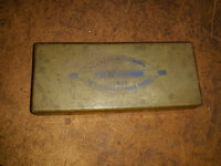
I am not a Craftsman guy, but I couldn't let this pass:

Smokeshow69
Well-known member
I am not a Craftsman guy, but I couldn't let this pass:


Is it a sharpening stone ? Looks like a good pickup!
bmwrd0
Well-known member
Yep, a two-sided stone.
FrankLee
Well-known member
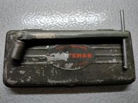
I picked up this group today. The hammers are not Craftsman.

The box for the sharpening stone has a crown logo, but the stone itself has an early logo. The box is in great shape. This looks unused.

The chisels and punch all have the long-underline C logo that match the case. These look unused, but need deep cleaning and the case needs tweaking. Not sure yet what pieces are missing. The panel with the logo slides up and down the case.
Edit: The '49 catalog shows a 5-piece Punch and Chisel Set in a pouch with a pin punch and a solid punch missing from my set.

I don't think the 1/2 x 9/16 is original to the wrench set. The heads look slightly more round. I can't insert the wire retainers with that wrench. I can't say that I've seen those wire retainers before.


The box for the sharpening stone has a crown logo, but the stone itself has an early logo. The box is in great shape. This looks unused.

The chisels and punch all have the long-underline C logo that match the case. These look unused, but need deep cleaning and the case needs tweaking. Not sure yet what pieces are missing. The panel with the logo slides up and down the case.
Edit: The '49 catalog shows a 5-piece Punch and Chisel Set in a pouch with a pin punch and a solid punch missing from my set.

I don't think the 1/2 x 9/16 is original to the wrench set. The heads look slightly more round. I can't insert the wire retainers with that wrench. I can't say that I've seen those wire retainers before.


Last edited:
JoCoSawdust
Well-known member
Nice haul Frank. I've yet to find any of the wrench racks with the retaining wire intact.
ooba tooba
Well-known member
- Joined
- Jan 13, 2014
- Messages
- 747
Nice haul FrankLee! First time I’ve seen that case. The decal looks really good on it still. I need to break down and get me one of those wrench racks eventually.
Last edited:
Smokeshow69
Well-known member
Nice haul FrankLee! First time I’ve seen that case. The decal looks really good on it still. I need to break down and get me one of those wrench racks eventually.
I have one for sale... It isnt as nice as franklee's but it does the trick. Pm inbound
Oldtuleguy
Well-known member
- Joined
- Nov 4, 2017
- Messages
- 10,461
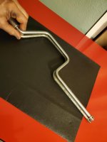
I'm stumped. My best guess is very early MDF. I have a couple of cad plated early MDF rats that have no makers mark on them but they do have the 2 horizontal lines on either side of Craftsman. Some of the smaller wrenches from the =V= era only have one line due to space, hence my question about it being 1/4" drive.
It is a match to this one other than the handle
Attachments

outofbounds
Well-known member

DaveT
Well-known member
Some 519x vises.........one of my vices
Ed, that is an incredible collection

Now if I could only find just one!
Ed, that is an incredible collection
Now if I could only find just one!
Thank you sir!, and good luck
drivesitfar
Well-known member
Ed: Dave is absolutely correct that we never get tired of you posting up your collection even if you do want to repaint a couple of them.
thanks again for preserving our good old vintage tools!!!!
thanks again for preserving our good old vintage tools!!!!
ooba tooba
Well-known member
- Joined
- Jan 13, 2014
- Messages
- 747
Ed, that is an incredible collection
Now if I could only find just one!
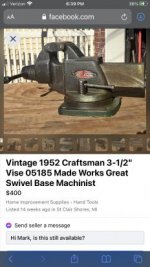
There’s one in St Clair Shores Mi.
But it’ll cost you.
Attachments

JoCoSawdust
Well-known member
I can never see too many pics of your vises Ed.
mcmlvif100
Well-known member
Not mine and no affiliation to either of these. Would be interested in the toolbox if it wasn't so far from me. The cash box is both too far and (IMO) a bit pricey. Hope that GJer picks up the toolbox.
Craftsman Tool Chest Rolling Base-Nice/Clean Older Mechanics Tool Box - $150 (Brownsburg)
https://indianapolis.craigslist.org/tls/d/brownsburg-craftsman-tool-chest-rolling/7290914009.html
Please call: For Sale - $150.00 - Cash
See ALL pics for measurements: 25-1/2 L x 17 W x 32 T
Vintage Craftsman - Tool Chest Rolling Base - Very Nice / Clean & Straight Older Mechanics Tool Box. NO Key..
------------------------------
Vintage CRAFTSMAN Locking Cash Box/Safe/Tool Box - $40 (Frankfort)
https://chicago.craigslist.org/sox/tls/d/frankfort-vintage-craftsman-locking/7289211952.html
Vintage Craftsman Locking Cash drawer/Tool Box WITH ORIGINAL KEY!
1950’s Logo.
Approximately 9.5” x 5” x 4.75” tall (Outside measurements).
Has initials A C on top. Otherwise in excellent vintage condition!
Craftsman Tool Chest Rolling Base-Nice/Clean Older Mechanics Tool Box - $150 (Brownsburg)
https://indianapolis.craigslist.org/tls/d/brownsburg-craftsman-tool-chest-rolling/7290914009.html
Please call: For Sale - $150.00 - Cash
See ALL pics for measurements: 25-1/2 L x 17 W x 32 T
Vintage Craftsman - Tool Chest Rolling Base - Very Nice / Clean & Straight Older Mechanics Tool Box. NO Key..
------------------------------
Vintage CRAFTSMAN Locking Cash Box/Safe/Tool Box - $40 (Frankfort)
https://chicago.craigslist.org/sox/tls/d/frankfort-vintage-craftsman-locking/7289211952.html
Vintage Craftsman Locking Cash drawer/Tool Box WITH ORIGINAL KEY!
1950’s Logo.
Approximately 9.5” x 5” x 4.75” tall (Outside measurements).
Has initials A C on top. Otherwise in excellent vintage condition!
DaveT
Well-known member
There’s one in St Clair Shores Mi.
But it’ll cost you.
Thanks ooba tooba for the info but that’s a little more that I want to spend. Part of the fun is the hunt for a good deal! One day it will come my way.
outofbounds
Well-known member
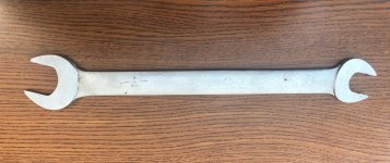
Turned up this tappet wrench in a lunch hour pick. Curious that there seems to never have been sizes stamped on it. Unless a PO was a truly first rate grinder AND polisher, seems to be unaltered. Was this a "thing" at any point with these wrenches?
Attachments

mcmlvif100
Well-known member
Turned up this tappet wrench in a lunch hour pick. Curious that there seems to never have been sizes stamped on it. Unless a PO was a truly first rate grinder AND polisher, seems to be unaltered. Was this a "thing" at any point with these wrenches?
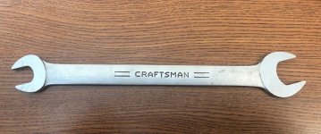
Have a similar wrench. Picked it up years ago at the local ReStore. As I recall, it's 5/8 and 7/8 inch. Was told that it might have come with something like a power tool. Regardless, the only marking is what you see in the picture.
Attachments

Cruzan80
Well-known member
Going to post this on both the Crowntop and Heritage threads, as the date code is right in the transition period...
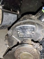
Anyone ever seen a motor labelled this before? Came on a private labelled Atlas metal lathe, made in 62 (both Timken bearings and bed date match). Thought it was interesting it was labelled as a Lathe motor, especially Sears brand, vs Craftsman. Looks very similar to the 1hp Crowntop hiding in the second pic. Same cradle, capacitor location, etc. This one has the badge where the Crowntop has a thermal reset button.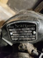
Sent from my IN2015 using The Garage Journal mobile app
Anyone ever seen a motor labelled this before? Came on a private labelled Atlas metal lathe, made in 62 (both Timken bearings and bed date match). Thought it was interesting it was labelled as a Lathe motor, especially Sears brand, vs Craftsman. Looks very similar to the 1hp Crowntop hiding in the second pic. Same cradle, capacitor location, etc. This one has the badge where the Crowntop has a thermal reset button.
Sent from my IN2015 using The Garage Journal mobile app
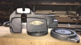
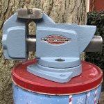
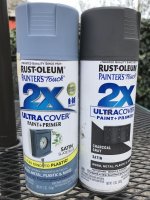
Has anyone tried Rustoleum 2X Satin Slate Blue as a match for Craftsman vises of Heritage era?
Is it too light? Too blue? Too Superman’s tights?
I stripped one of those squat 5176 3-1/2” homeowners vises and shook up a can of Charcoal Gray today, but decided it just wasn’t going to look right. There’s just a small patch of unmolested blue-gray under the spindle hub, as my guide, which the PO didn’t bomb with metalic green.
I got one response on the big vise thread, but thought this thread might have more specific experience.
UPDATE: Yes, Slate Blue is too light. I tried spraying simultaneously with Charcoal Gray. If they had actually blended, the result would be about right, but they didn’t. The bubbles make me think the ingredients don’t like each other.
If I wanted to repaint again, I’d probably go with Deep Forest. It’s too green, but at least a darker color. Instead, I’ll wait a month and see if some BLO tinted with black enamel from a can will tone this down a bit.
UPDATED UPDATE: Spotted a can of Chaulked Anvil Gray, and thought I’d try it. It has some blue to it, but darker than original. It’s made to be distressed, so I don’t expect it to “hold up.” That’s okay; the lighter blue will start to peek through. I’ll give it a week or so, then give the whole thing a light coat of BLO.
Is it too light? Too blue? Too Superman’s tights?
I stripped one of those squat 5176 3-1/2” homeowners vises and shook up a can of Charcoal Gray today, but decided it just wasn’t going to look right. There’s just a small patch of unmolested blue-gray under the spindle hub, as my guide, which the PO didn’t bomb with metalic green.
I got one response on the big vise thread, but thought this thread might have more specific experience.
UPDATE: Yes, Slate Blue is too light. I tried spraying simultaneously with Charcoal Gray. If they had actually blended, the result would be about right, but they didn’t. The bubbles make me think the ingredients don’t like each other.
If I wanted to repaint again, I’d probably go with Deep Forest. It’s too green, but at least a darker color. Instead, I’ll wait a month and see if some BLO tinted with black enamel from a can will tone this down a bit.
UPDATED UPDATE: Spotted a can of Chaulked Anvil Gray, and thought I’d try it. It has some blue to it, but darker than original. It’s made to be distressed, so I don’t expect it to “hold up.” That’s okay; the lighter blue will start to peek through. I’ll give it a week or so, then give the whole thing a light coat of BLO.
Attachments
-
 5E3102C0-5C8A-4D23-9E89-FAAB01B7E54C.jpg152.7 KB · Views: 28
 -
 C0C5F9F8-B989-4577-9C6C-EB555EE0AF27.jpg96.1 KB · Views: 25
 -
 5B0A937D-1345-46F2-9B78-093AE7CE46E5.jpg149.9 KB · Views: 20
 -
 D9D66C00-5617-40C9-8F23-E66D9E052677.jpg149.8 KB · Views: 15
 -
 FC817FC3-1AC5-42D0-8C61-E3BD46F36815.jpg119.2 KB · Views: 13
 -
 5E88B135-3C62-4162-A147-6C2F2541C130.jpg100.7 KB · Views: 16
 -
 D13B1386-61F7-4BFB-BA06-DF0566C3AFED.jpeg367.3 KB · Views: 5
 -
 657C3B65-36D8-458D-BEA5-9856195F3260.jpeg673.4 KB · Views: 4
Last edited:
outofbounds
Well-known member
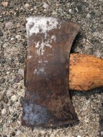
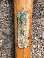
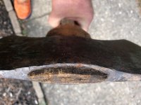
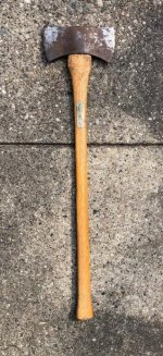
I had this Double Bit Axe hanging around in the corner of my garage and I'm pretty sure I won't be felling any trees soon, so planning on offering it up to a new owner, as all vintages axes seem to be hipster hot right now.......
Can anyone confirm the age of this to be consistent with the Heritage logo era in the 1950s?
Also any comments as to the originality of the handle (I believe it ought to be......) but appreciate being corrected where appropriate in the interest of accuracy.
Can anyone confirm the age of this to be consistent with the Heritage logo era in the 1950s?
Also any comments as to the originality of the handle (I believe it ought to be......) but appreciate being corrected where appropriate in the interest of accuracy.
Attachments

Bugeyed Earl
Well-known member
Smokeshow69
Well-known member
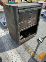
Spotted this at a flea market this morning, seller was asking $25.

Did you buy it ? Priced right...

Oldtuleguy
Well-known member
- Joined
- Nov 4, 2017
- Messages
- 10,461
Interesting door on the front.
Bugeyed Earl
Well-known member
Did you buy it ? Priced right...
Yeah, great price, but I just picked one up a few months ago.
Interesting door on the front.
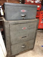
Yes, I haven't seen that version before. The door is hinged in the middle to fold, and it covers all the drawers and the opening at the bottom. One panel has a recess that the handle on the opposite panel fits into.
Neat idea, but after 60+ years of getting knocked around, it's going to need a little fiddling to work right again.
Oldtuleguy
Well-known member
- Joined
- Nov 4, 2017
- Messages
- 10,461
What do the slides look like?
JoCoSawdust
Well-known member
That would've been a hard one for me to pass up. 49-52-ish.
Bugeyed Earl
Well-known member
What do the slides look like?
I didn't get a look at them.
That would've been a hard one for me to pass up. 49-52-ish.
It wasn't easy, especially with the seller yelling after me that he'd take $20
 It was late in the morning and getting hot, I might have to go back next weekend and see if he still has it.
ooba tooba
Well-known member
- Joined
- Jan 13, 2014
- Messages
- 747
Yeah, great price, but I just picked one up a few months ago.
Yes, I haven't seen that version before. The door is hinged in the middle to fold, and it covers all the drawers and the opening at the bottom. One panel has a recess that the handle on the opposite panel fits into.
Neat idea, but after 60+ years of getting knocked around, it's going to need a little fiddling to work right again.
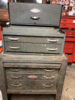
I have that door style on mine.
Attachments
Bugeyed Earl
Well-known member
That's it, and with a matching top box too! Very nice!
Smokeshow69
Well-known member
What do the slides look like?
OTG-what is your question ? I just pulled a few parts off one of these for my slightly more modern Crown top badged 8 drawer roller. (59'date)..the slides on these are physically are identical to the slightly more modern ones, only difference is the size of the hole that is used when depressing the tang to remove the drawers...
Oldtuleguy
Well-known member
- Joined
- Nov 4, 2017
- Messages
- 10,461
Just curious. I have a wards with that style door but pressteel roller drawers.
Smokeshow69
Well-known member
Just curious. I have a wards with that style door but pressteel roller drawers.
Interesting.... no, these are all friction slides... only craftman from around this time to carry the roller bearing slides were the deluxe cabinets made by presssteel offered in the 50's. However those are physically larger than these style of rollers.
ooba tooba
Well-known member
- Joined
- Jan 13, 2014
- Messages
- 747
Username already in use
Well-known member
Some Heritage era from the flea last week. The pipe threader has all the Craftsman dies and the tape measure is in great shape.
I need to spend some time cleaning up the pipe threader.

I need to spend some time cleaning up the pipe threader.
Smokeshow69
Well-known member
Oh man, that tape measure! And I see some good stuff in the back ground!Some Heritage era from the flea last week. The pipe threader has all the Craftsman dies and the tape measure is in great shape.
I need to spend some time cleaning up the pipe threader.