To avoid these ads, REGISTER NOW!

V3 Bug/Suggestion Box

To avoid these ads, REGISTER NOW!

Vintage Veloce

Well-known member
Joined
Feb 27, 2015
Messages
1,076
Location
San Diego
Love the new site.
I might go a bit smaller on the fonts to condense stuff a little bit.
And consider playing with the responsive design settings a bit. You can change the breakpoints.
If I use my phone in landscape, the headers and stuff jump to a pretty large size.
And on my tablet the headers are large in both portrait and landscape mode.
Personally, I like to set stuff up so even unregistered visitors see the threads, and not just the headers and an advert.
(Note the responsive design also effects whether signatures are shown, it is great deleting them in portrait mode on phones, as it does now on mine at least.)
 

merkyworks

Well-known member
Joined
Nov 11, 2016
Messages
587
Location
Texas
Thank you for your hard work on upgrading site.
Overall upgrades are very nice, but I'm with others on font "Default Style"switching to "XF 2.2" was a must for me.

"Default Style"
  • Font type hard to read
  • Page format/scale/layout to large (feels like 130% zoom)
    • Phone/11" Laptop it's so big/spread out it, reminds me of using a microfilm reader LOL. Making smaller/condensing would be welcome.
 
Last edited:

Lassen Forge

Well-known member
Joined
Apr 26, 2014
Messages
15,023
Location
The romantic hills of central Umbria, Italy,
Thanks, Ryan... I know you're going to have a fun weekend... or 2... --lol--

One other thing - someone already mentioned it - I had my account to list IIRC 40 messages at a time... any way of bringing that variable back? Otherwise I lose entire pages of posts when I'm not constantly on!

Rock on, brother!
 

1982fxr

Well-known member
Joined
Jan 7, 2012
Messages
9,991
Location
Phoenix
Yep, font is really bad... BUT...To those unhappy with the font, go to your preferences (drop-down from your user name at the top) and change the "style" to "stock XF 2.2 style". This makes it similar to the old forums and much easier to read.
The top doesn't display my user name just my sig pic and I don't see any drop down...?

I'm not trying to be a jerk but the way this is displaying and operating for me, it is the most unusable forum format I've ever seen.
 

619DioFan

Well-known member
Joined
Apr 9, 2013
Messages
3,617
Location
San Diego , Ca.
I looked at my profile page but there is no longer any info there ( the info I loaded about myself ) also didnt see anything about pms there or how to send them now. saw some message about trophies but dont know what that means
 

Vintage Veloce

Well-known member
Joined
Feb 27, 2015
Messages
1,076
Location
San Diego
The top doesn't display my user name just my sig pic and I don't see any drop down...?

I'm not trying to be a jerk but the way this is displaying and operating for me, it is the most unusable forum format I've ever seen.
The width of your window or screen can effect what you are seeing. On a phone or tablet rotate it. On a computer make the window wider...
 

Old Man Roger

Well-known member
Joined
Apr 6, 2017
Messages
17,407
Location
Palm Coast Florida
The top doesn't display my user name just my sig pic and I don't see any drop down...?

I'm not trying to be a jerk but the way this is displaying and operating for me, it is the most unusable forum format I've ever seen.
Click on your avatar picture and then look in the bottom left corner you should be able to click on the font type and choose
 

Old Man Roger

Well-known member
Joined
Apr 6, 2017
Messages
17,407
Location
Palm Coast Florida
I looked at my profile page but there is no longer any info there ( the info I loaded about myself ) also didnt see anything about pms there or how to send them now. saw some message about trophies but dont know what that means
Click on the envelope on the top right corner of the screen, and you can choose to start a new conversation. That’s what PMs are called now.
 

yatg

Well-known member
Joined
Aug 16, 2019
Messages
2,749
Location
Southern Oregon
Went into a thread I have in classified to say its sold, and there's no "post reply" button. After the last post at the lower right it says "You have insufficient privileges to reply here.".
 

rice rocket

Well-known member
Joined
Mar 24, 2011
Messages
3,175
THANK YOU!

That font was brutal to try to read.

If other forums are happy with it, I picture those users as a bunch of old codgers with their screen resolution set to 640x480, heads tilted back, granny glasses perched on the ends of their noses and screen zoomed in so far they have to scroll to read a single post on this new fangled e-lec-tronic newspaper.
This.

Serif fonts display horribly on screens, especially really tall, narrow fonts. Serifs are meant for print, not for displays.

Pick almost any sans serif font, it will be a million times better.
 
OP
R

Ryan

Administrator
Staff member
Joined
Jan 26, 2006
Messages
5,694
Location
Texas/Hawaii
Went into a thread I have in classified to say its sold, and there's no "post reply" button. After the last post at the lower right it says "You have insufficient privileges to reply here.".

Thank you sir. Just put it on the list.
 

d42jeep

Well-known member
Joined
Oct 22, 2014
Messages
16,496
Location
Northern California
I now seem to have to reduce the size of my pictures to upload. That is inconvenient and wasn’t necessary previously. Otherwise I’m slowly adjusting.
-Don
 
OP
R

Ryan

Administrator
Staff member
Joined
Jan 26, 2006
Messages
5,694
Location
Texas/Hawaii
I now seem to have to reduce the size of my pictures to upload. That is inconvenient and wasn’t necessary previously. Otherwise I’m slowly adjusting.
-Don

This is what I am currently working on... Should be fixed soon.
 

NewShockerGuy

Well-known member
Joined
Oct 12, 2010
Messages
2,481
Location
Northern Virginia / DC
Was the theme update removed? This was the before, then when I go to perferences it's looks like the second picture.
gjbefore.JPG

After:
gjafter.JPG

Is there a chance we can get a dark theme? I ask this because all the white is extremely "bright" in a way. Most forums I'm on there is a feature for a darker color theme and it makes browsing on a laptop/phone much easier on the eyes..etc.

It's funny seeing GJ and being used to how it looked for 10+ years, then it was down and now looks like it does all modern..lol. Nice job. definitely adding pictures is much nicer and you can put it in the thread and add text...etc. I didn't dislike the old way but this way is much better.

Thanks,
-Nigel
 

jtitus07

Active member
Joined
Oct 20, 2018
Messages
25
Location
OH
Can you send me a link to that thread. If you are logged on, you should not be seeing that....


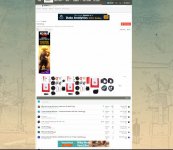
Here's an example. Some sub forums are better than others. This was the worst, but still representative of most.

ETA, another screenshot f a different sub forum
 

Attachments

  • ads.JPG
    ads.JPG
    239 KB · Views: 31
  • ads2.JPG
    ads2.JPG
    126.9 KB · Views: 31
  • ads3.JPG
    ads3.JPG
    127.1 KB · Views: 27
To avoid these ads, REGISTER NOW!

freudianfloyd

Well-known member
Joined
Feb 12, 2015
Messages
3,426
Location
Nowhere
It was mentioned previously, but I think it got overlooked. When trying to upload pictures that would normally work, I am getting an error saying the file is too large.
 

KnurledNut

Well-known member
Joined
Jan 28, 2011
Messages
8,092
Location
n/a
Ryan, any way to get rid of the ads plastered everywhere? Thanks for all your efforts.
 
OP
R

Ryan

Administrator
Staff member
Joined
Jan 26, 2006
Messages
5,694
Location
Texas/Hawaii
Was the theme update removed? This was the before, then when I go to perferences it's looks like the second picture.
gjbefore.JPG

After:
gjafter.JPG

Is there a chance we can get a dark theme? I ask this because all the white is extremely "bright" in a way. Most forums I'm on there is a feature for a darker color theme and it makes browsing on a laptop/phone much easier on the eyes..etc.

It's funny seeing GJ and being used to how it looked for 10+ years, then it was down and now looks like it does all modern..lol. Nice job. definitely adding pictures is much nicer and you can put it in the thread and add text...etc. I didn't dislike the old way but this way is much better.

Thanks,
-Nigel

That was the default style. It was cached... I don't have the time right now to manage two styles... BUT, I will be doing a dark theme....
 

laser3kw

Well-known member
Joined
Nov 17, 2012
Messages
7,276
Location
northen IL
Yep, font is really bad... BUT...To those unhappy with the font, go to your preferences (drop-down from your user name at the top) and change the "style" to "stock XF 2.2 style". This makes it similar to the old forums and much easier to read.
Hmm... I changed it to "stock XF 2.2 style" an hour or so ago and alll was good.
I came back (still logged in) and the font reverted back to original. Went back to preferences and "style" is gone. I am now stuck with the original. I logged out and back in and still no go - "styles" is gone in preferences.
 

NUTTSGT

Super Moderator
Staff member
Joined
Sep 14, 2009
Messages
50,863
Location
Northern Central Ohio
I can't afford the bandwidth at 100, but I just bumped it up from 20 to 30. Hope that helps.
Is this why there is no longer a feature to "View All" rather than going page by page when looking at a thread ?


As far as changing the font, I have no option to change style/font.
 
OP
R

Ryan

Administrator
Staff member
Joined
Jan 26, 2006
Messages
5,694
Location
Texas/Hawaii
Is this why there is no longer a feature to "View All" rather than going page by page when looking at a thread ?


As far as changing the font, I have no option to change style/font.

Correct. "View all" was a hack that I did with VB. I haven't tried to code that for Xenforo, but plan too...

I am working on fonts right now in an effort to ease the pain for some folks.
 

NUTTSGT

Super Moderator
Staff member
Joined
Sep 14, 2009
Messages
50,863
Location
Northern Central Ohio
I see where the "Style" button should be when Git posted a screen shot. However, on my drop down, Time Zone is the highest I can read where I suppose "style" is supposed to be at the top.

I see you have the font changed, Much better on the PC and on the phone. THANK YOU ! !
 
OP
R

Ryan

Administrator
Staff member
Joined
Jan 26, 2006
Messages
5,694
Location
Texas/Hawaii
I see where the "Style" button should be when Git posted a screen shot. However, on my drop down, Time Zone is the highest I can read where I suppose "style" is supposed to be at the top.

I see you have the font changed, Much better on the PC and on the phone. THANK YOU ! !

That was cached... if folks can see it now, they won't be able to for long...
 
OP
R

Ryan

Administrator
Staff member
Joined
Jan 26, 2006
Messages
5,694
Location
Texas/Hawaii
Either I am used to the original or you already changed it to something easier to read. Either way, my eyes say thank you!

I was getting font complaints right off the bat... and I was all like, "What the hell? I literally used the most readable font ever developed - the font used by the US highway system... How can these people complain?!"

And then I realized Garamond (the font I use in my blog posts) somehow got merged into the forum...

FML.
 

theoldwizard1

Well-known member
Joined
Feb 22, 2011
Messages
43,077
Location
SE MI
Fonts need to be more readable... Tahoma is my choice. What we have is very hard to read for my eyes... and no... blowing it bigger is NOT good... there is already an extreme amount of "space" between things. I feel like I'm in an out of control bubble bath without my glasses. .
Use a font that has serifs !
 

NUTTSGT

Super Moderator
Staff member
Joined
Sep 14, 2009
Messages
50,863
Location
Northern Central Ohio
I was getting font complaints right off the bat... and I was all like, "What the hell? I literally used the most readable font ever developed - the font used by the US highway system... How can these people complain?!"

And then I realized Garamond (the font I use in my blog posts) somehow got merged into the forum...

FML.
LOL, same font as US Highway system. . . now I know why some people drive like they do ! (wanted to add a laughing smilie)

Please add new smilies to the Wanted List.
 
OP
R

Ryan

Administrator
Staff member
Joined
Jan 26, 2006
Messages
5,694
Location
Texas/Hawaii
LOL, same font as US Highway system. . . now I know why some people drive like they do ! (wanted to add a laughing smilie)

Please add new smilies to the Wanted List.

Yes sir... I am shopping now... And man, smilie sets are expensive as ****!
 

kaymccampbell

Well-known member
Joined
Feb 27, 2015
Messages
29,431
Location
Upstate New York
Might as well pile it on. Search seems to be hit or miss. I'm assuming that the indexes haven't finished building, but just in case they have... There's holes.
 
To avoid these ads, REGISTER NOW!
Top Bottom